Whether you live by the seaside or not, you can now turn your home into a relaxing seascape with these coastal home decor ideas featuring earthy tones with blue accents.
Scroll down to find out what is a coastal color palette, what are earthy tones, whether blue goes with earthy tones and why you would choose such a combination.
I’ll answer all these questions featuring real products for the home so that you can judge by yourself whether this looks good or not.

What is a coastal palette?
A coastal color palette is a range of colors inspired by your typical beach seascape: pastel blues, angry storm blues, airy whites and creams, light beige tints resembling the sand and darker brown shades inspired by driftwood.
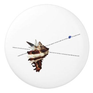
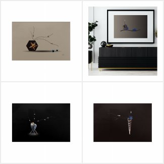
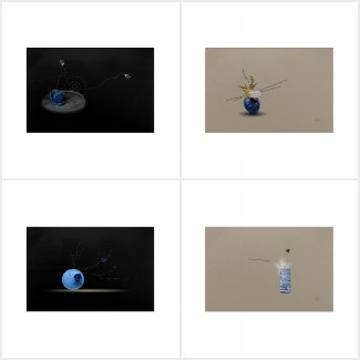
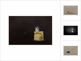
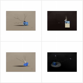
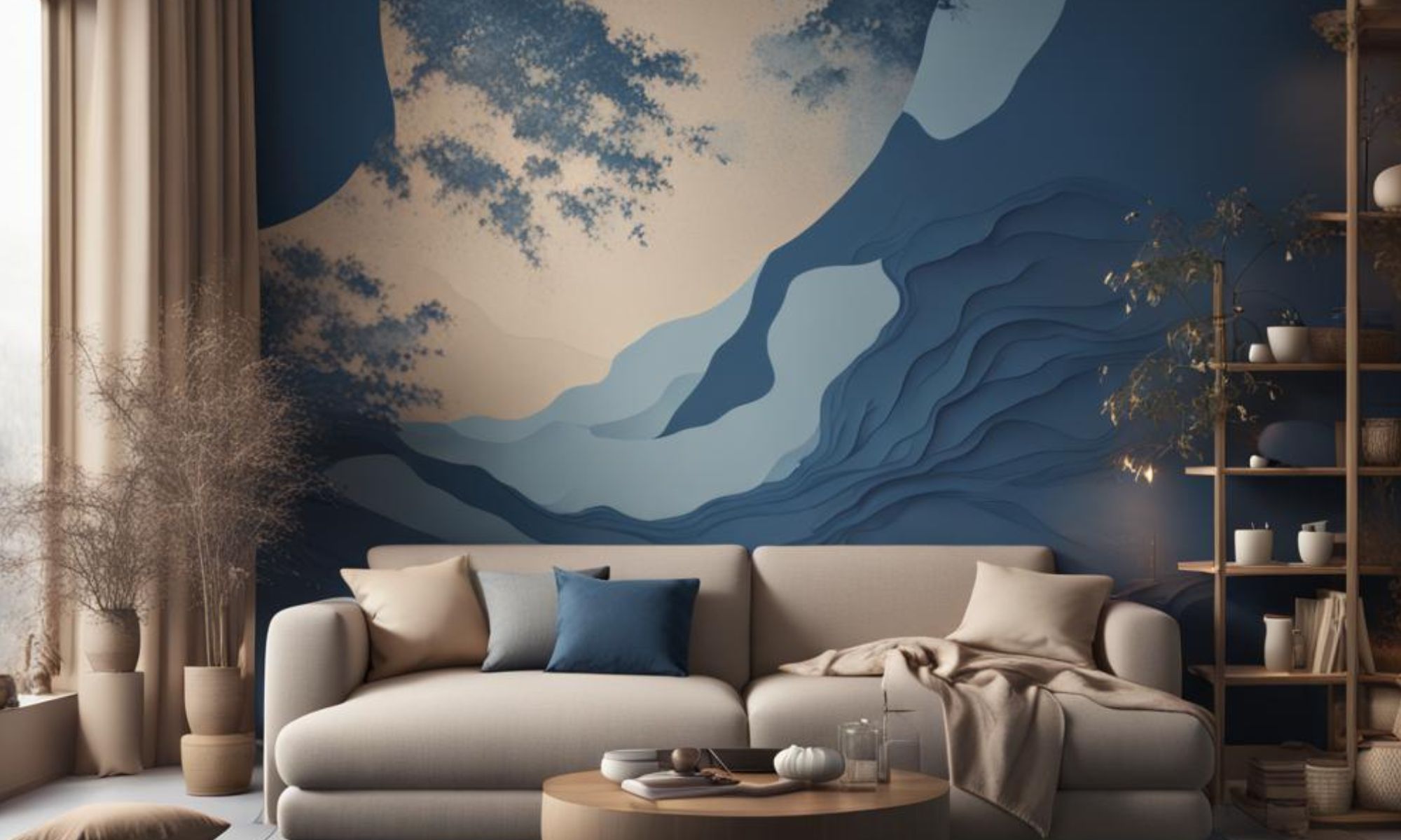
The wall art is one such example where you can notice several hues of brown mixed in with some blue accents. The image is actually a visual poem about the first signs of aging once youth is gone.

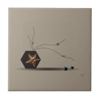
Another example of a coastal color palette is this ceramic tile below, featuring two blue iris flowers resting near a seashell flower hexagonal vase with lots of darker and lighter hues of brown against a sandy and neutral beige background. This beige tile would fit very well in a beach themed bathroom.
What are earthy tones?
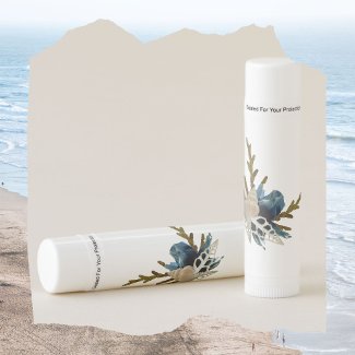
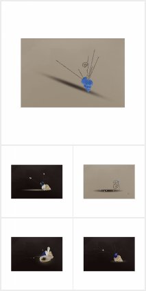
Earthy tones include any color with a bit of brown in it, reminding you of earth, soil or the ground, like in the desk or shelf decor you see below.
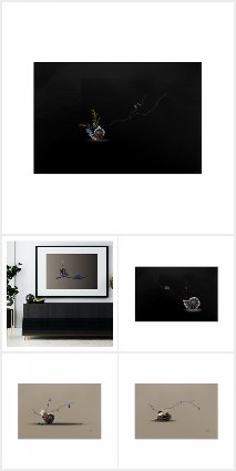
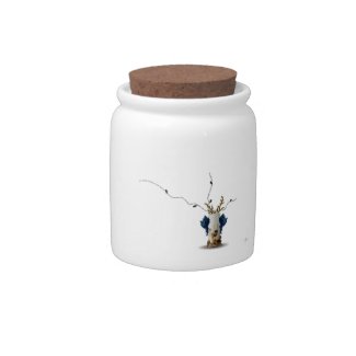
For example, if you mix blue with a bit of brown, you’ll get an earthy blue tone, like you see in the lateral dark blue Murex snail shells from this candy jar.
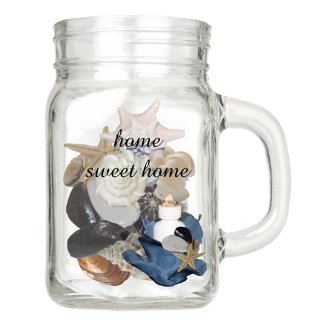
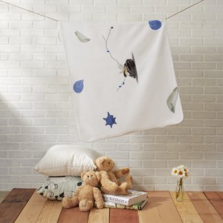
And while we usually associate a coastal seascape with lots and lots of blue, actually there is quite a bit of brown in it from the sand, driftwood or shells, like you see in the coastal baby blanket featured below.
Does blue go with earthy tones?
By being quite dull neutral colors, earthy tones theoretically go well with any other color, just like black and white do, so you can’t go wrong if you pair an earthy tone color with blue.
But the reason for which I favor this combination in just about any visual poem I design is that it represents best the planet on which we both live. We both call it Earth (which is brown), but also The Blue Planet.
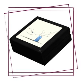
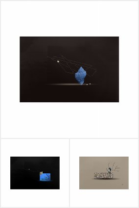
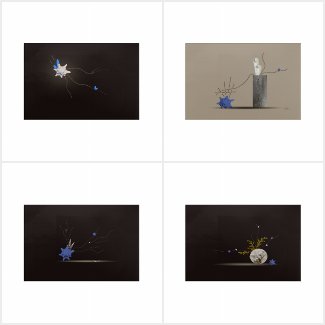
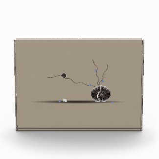
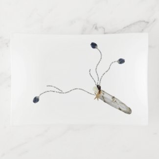
As an example of pairing blue with earthy brown shades, take a look at the visual poem printed on the trinket tray below. It is called “Grateful” and it depicts the irony of being grateful for not getting what I wanted and getting what I didn’t want, which worked out better than expected in the end. The three blue iris flowers from it are actually made of seashells from the Black Sea.
I first got the idea of mixing the earthy tones with the seascape blue hues after finding out about Japanese dry gardens, rock gardens or Zen gardens where sand represents the waves of the sea, while tall stones represent islands or mountains.
I tried to create such harmony in each of my visual poems and I’d love it if you could tell me in a comment below what do you think about pairing earthy tones with blue accents and whether you’d like this combination in your home. Until then, I’ll leave you with a couple of more examples of coastal home decor ideas to scroll through, finishing with an edible and sweet one 🙂